


Series of 3
Glyphs
Glyphs
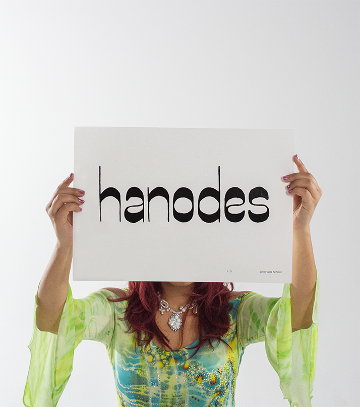
Hanodes
I dealt with the structure of fonts. How are letters put together, what spacing do they have to have in relation to each other? I examined various contrast types: Expansion, Translation and Transitional. These investigations gave me the basis for designing my own typeface. In my grotesque font, the different stroke widths between the verticals and horizontals are very pronounced.